Construits en 1973 par le statisticien Francis Anscombe dans le but de démontrer l’importance de tracer des graphiques avant d’analyser un ensemble de données.
%pylab --no-import-all inline
from scipy.stats import linregress, pearsonr
Populating the interactive namespace from numpy and matplotlib
Lecture des données
Le fichier anscombe.dat est téléchargeable ici.
all_sets = list()
for i in range(0, 8, 2):
    x, y = np.loadtxt("anscombe.dat", usecols=(i, i+1), skiprows=1, unpack=True)
    all_sets.append((x, y))
print(all_sets[0][0])
print(all_sets[0][1])
[10.  8. 13.  9. 11. 14.  6.  4. 12.  7.  5.]
[ 8.04  6.95  7.58  8.81  8.33  9.96  7.24  4.26 10.84  4.82  5.68]
Calcul des propriétés statistiques
Ici on montre que les quatre jeux de données ont les même propriétés statistiques.
def show_stat(data):
    x, y = data
    print("moyenne  x  : %4.2f" % x.mean())
    print("variance x  : %4.2f" % np.var(x))
    print("moyenne  y  : %4.2f" % y.mean())
    print("variance y  : %4.2f" % np.var(y))
    cor, p = pearsonr(x, y)
    print("corrélation : %5.3f" % cor)

    a, b, r, p_value, std_err = linregress(x, y)
    print("regression linéaire : %3.1f x + %3.1f (r^2 = %4.2f)" % (a, b, r**2))
for i, data in enumerate(all_sets):
    print("\nset %d" % i)
    print("------")
    show_stat(data)
set 0
------
moyenne  x  : 9.00
variance x  : 10.00
moyenne  y  : 7.50
variance y  : 3.75
corrélation : 0.816
regression linéaire : 0.5 x + 3.0 (r^2 = 0.67)

set 1
------
moyenne  x  : 9.00
variance x  : 10.00
moyenne  y  : 7.50
variance y  : 3.75
corrélation : 0.816
regression linéaire : 0.5 x + 3.0 (r^2 = 0.67)

set 2
------
moyenne  x  : 9.00
variance x  : 10.00
moyenne  y  : 7.50
variance y  : 3.75
corrélation : 0.816
regression linéaire : 0.5 x + 3.0 (r^2 = 0.67)

set 3
------
moyenne  x  : 9.00
variance x  : 10.00
moyenne  y  : 7.50
variance y  : 3.75
corrélation : 0.817
regression linéaire : 0.5 x + 3.0 (r^2 = 0.67)
Représentation graphique des données
La représentation graphique de ces jeux de données a deux objectifs. Elle montre
- qu’il est important de visualiser les données pour faire une interprétation
- que des données aberrantes peuvent avoir un impact majeur sur certaines propriétés statistique telle que la moyenne.
fig = plt.figure(figsize=(10, 8))
fig.suptitle("Quartet d'Anscombe", size=20)
for i, data in enumerate(all_sets):
    ax = plt.subplot(2, 2, i + 1)
    x, y = data
    ax.plot(x, y, marker="o", color="C3", linestyle="", label="set %d" % (i+1))
    ax.set_ylabel("y%d" % (i+1), size=14)
    ax.set_xlabel("x%d" % (i+1), size=14)

    a, b, r, p_value, std_err = linregress(x, y)
    ax.plot([0, 20], [b, a*20 + b], color="C0")

    ax.set_xlim(0, 20)
    ax.set_ylim(0, 15)
    ax.legend(loc="lower right", fontsize=18)
    ax.grid(True)
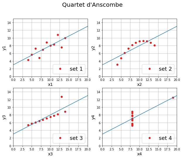
Contrairement à ce que montrent les indicateurs statistiques, les quatre jeux de données sont très différents.
Voici un commentaire tiré de l’article original d’Anscombe.
Unfortunately, most persons who have recourse to a computer for statistical analysis of data are not much interested either in computer programming or in statistical method, being primarily concerned with their own proper business. Hence the common use of library programs and various statistical packages. Most of these originated in the previsual era. The user is not showered with graphical displays. He can get them only with trouble, cunning and a fighting spirit. It’s time that was changed.
Anscombe, F. J. The American Statistician 1973, 27 (1), 17–21.
Compléments
En complément voici un article qui présente le quartet d’Anscombe ainsi qu’une méthode de type Monte-Carlo permettant de construire des jeux de données de formes très différentes mais en conservant les indicateurs statistiques.
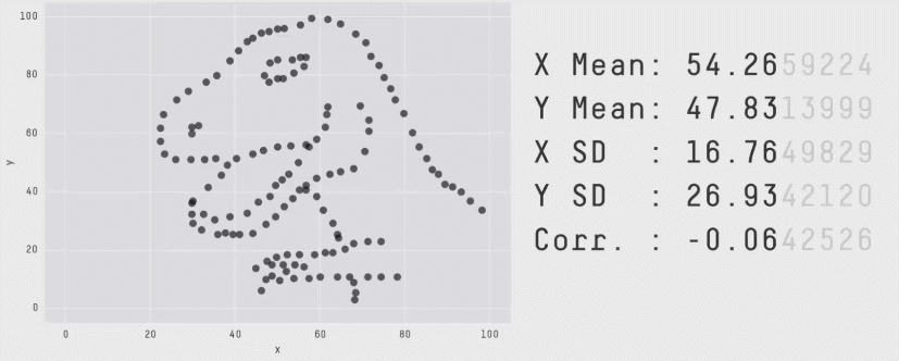
source : https://www.autodeskresearch.com/publications/samestats